Website Friction That Can Stop Prospective Clients Enquiring
Law firm website conversion mistakes can prevent prospective clients from enquiring when messaging, navigation, calls to action, forms, trust signals or mobile usability create friction. LawyerSEOMarketing.com.au identifies these barriers and improves the relevant website experience through Conversion Rate Optimization and Law Firm Website Development.
Why Website Friction Stops Law Firm Enquiries
Website friction stops law firm enquiries when a prospective client cannot quickly understand the service, trust the firm or complete the next step.
Prospective clients often arrive with an urgent legal problem and limited patience. A law firm website must make the relevant service clear, answer the client enquiry, and provide a simple path to contact the firm.
The Law Firm Website Mistakes That Create Conversion Friction
Law firm website mistakes reduce the conversion rate when the user experience does not match what visitors need at each stage of their decision.
We look at the complete website conversion path, from the first legal search to the completed enquiry. The practical aim is to remove barriers without changing the legal services the firm provides.
The Homepage Does Not Explain Who the Law Firm Helps
A homepage must state who the law firm helps and which legal matters it handles.
This mistake happens when the value proposition uses broad claims that do not identify the target audience or practice area. Visitors may leave because they cannot tell whether the firm understands their problem.
The cost is lost attention at the first stage of the conversion path. We fix the message by connecting the homepage promise to clear legal service pages and relevant enquiry options.
The Website Uses Unclear Calls to Action
An unclear call to action makes the next step uncertain for a visitor with enquiry intent.
This happens when buttons use vague wording, compete with one another, or send visitors to a generic contact page without context. The visitor must work out whether to request a consultation, ask a question, or provide details.
The cost is a broken conversion path between interest and contact. We use specific calls to action that match the page purpose and make the consultation request easier to understand.
Confusing Navigation Hides Relevant Legal Services
Confusing website navigation makes relevant legal services harder to find.
This mistake often comes from an information architecture that reflects the firm’s internal structure instead of the user journey. Practice areas may be buried in menus, grouped under unclear labels, or disconnected from useful internal links.
The cost is a longer route to the right practice area page. We reorganise the navigation menu and internal links so users can move from a general concern to a relevant service page.
Practice Area Pages Do Not Answer Prospective Client Questions
A practice area page should answer the client questions that arise from a specific legal problem.
This mistake happens when service pages list legal terms without explaining the issue in plain language. The content may also ignore search intent, common concerns, the likely next step, or what information the firm needs.
The cost is weak relevance and lower confidence before the visitor reaches the form. We improve practice area pages by aligning the content with user intent, useful questions, and a clear enquiry option.
The Website Gives Visitors Too Little Reason to Trust the Firm
Trust signals give a prospective client reasons to believe the firm can understand and handle the legal problem.
This mistake occurs when solicitor profiles are thin, case information lacks context, or the website gives little client reassurance. Visitors may not know who they will speak with or whether the firm works with matters like theirs.
The cost is hesitation at the point when the visitor is deciding whether to make contact. We strengthen credibility with accurate profiles, useful explanations, clear team information, and trust content that supports the service claim.
Contact Forms Ask for Too Much or Fail to Send Reliably
A contact form should collect enough information to begin the enquiry without creating unnecessary effort.
This mistake happens when forms use too many fields, unclear validation messages, poor labels, or a submission process that does not work as expected. A form may appear to submit while the lead notification fails to reach the right team.
The cost is lost enquiries and uncertainty about whether anyone received the form submission. We test form usability, validation, confirmation messages, lead notification, and enquiry handling from the visitor’s perspective.
The Mobile Website Makes Enquiring Difficult
Mobile usability determines whether visitors can read, navigate, and contact a firm on a smaller screen.
This mistake appears when responsive design breaks, mobile navigation is hard to open, tap targets are cramped, or forms require excessive scrolling. A visitor may abandon the mobile enquiry even when the service is relevant.
The cost is a poor mobile experience for users who are ready to act. We review the mobile layout, navigation, text flow, buttons, and form journey across relevant screen sizes.
Slow or Distracting Pages Interrupt the Enquiry Journey
Slow or distracting pages interrupt the user’s attention before the enquiry journey is complete.
This mistake can come from heavy page elements, poor content layout, movement that competes with the message, or intrusive elements that cover the next step. The visitor must wait, close something, or search for the relevant information.
The cost is reduced engagement on pages that should support lead generation. We review page performance and content layout, then remove distractions that interfere with reading and action.
The Website Does Not Reflect the Searcher’s Legal Intent
A landing page should reflect the searcher’s legal intent and connect the query to a relevant service.
This mistake happens when keyword relevance is treated as a wording exercise without considering the legal problem behind the search. A visitor may land on a broad page that does not address the concern that prompted the legal search.
The cost is a mismatch between the search promise and the conversion intent. We align landing page content, page purpose, and calls to action with the user’s likely question.
How We Diagnose Website Conversion Mistakes
We diagnose law firm website conversion mistakes by tracing the journey from search entry point to enquiry and testing the content, interface and form experience at each stage.
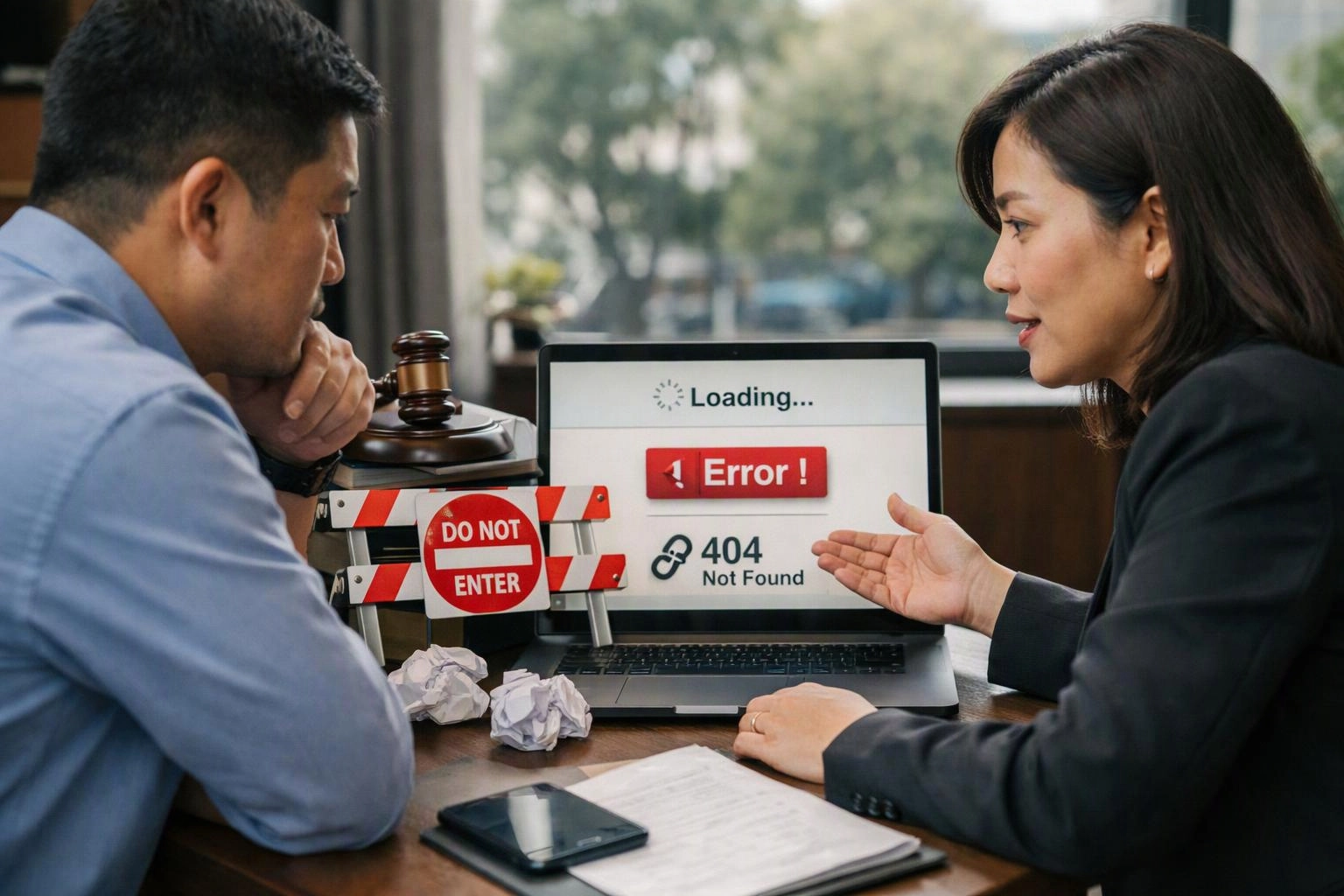
Our process separates a content problem from a technical or usability problem. We then connect the findings to the pages and actions that matter most.
What We Improve When a Law Firm Website Is Not Getting Leads
When a law firm website is not getting leads, we improve the parts of the conversion pathway that prevent relevant visitors from taking the next step.
Our Conversion Rate Optimization work may focus on messaging, page structure, calls to action, form usability, trust content, mobile layouts, or technical performance. Our Law Firm Website Development work supports broader changes when the existing structure cannot provide a clear experience.
We prioritise improvements by their role in the user journey. A landing page may need clearer intent, while a contact page may need a simpler form and more reliable lead handling.
When to Ask LawyerSEOMarketing.com.au to Review the Website
A law firm should ask us to review its website when visitors appear interested but the enquiry path is unclear or unreliable.
These situations usually point to a conversion audit or targeted website redevelopment. We assess the evidence before recommending changes.
Our team can review the website structure, content, forms, mobile experience, and tracking together. That creates a clearer basis for deciding which website improvement should come first.
How to Turn a Friction-Filled Law Firm Website Into a Clear Enquiry Path
A clear enquiry path connects the prospective client’s legal problem to a relevant service, useful information, trust content, and an easy next step.
We improve the user experience by making each page answer its purpose. The homepage identifies who the firm helps, practice area pages address user intent, and contact forms make submission straightforward.
Conversion strategy works best when content, interface, technical performance, and enquiry handling support one another. Our team tests that complete journey so website improvement is tied to a practical client enquiry.
Questions About Law Firm Website Conversion Mistakes
How can I tell whether my law firm website is losing potential clients?
A law firm website may be losing potential clients when relevant visitors reach service pages but do not continue to a clear enquiry step. We investigate entry pages, user journeys, calls to action, form submissions, mobile behaviour, and lead notification reliability.
Why do visitors leave a law firm website without making an enquiry?
Visitors leave a law firm website without making an enquiry when the service message, trust information, navigation, page content, or next step does not match their legal problem. Mobile difficulty, slow pages, and unreliable forms can also interrupt the enquiry journey.
What should a law firm contact form include?
A law firm contact form should include clear labels, only the information needed to begin the enquiry, useful validation messages, and a clear confirmation after submission. We also check whether form submissions create a reliable lead notification for the relevant team.
How can a law firm improve conversions without changing its services?
A law firm can improve conversions without changing its services by clarifying the website message, simplifying navigation, improving practice area pages, strengthening trust content, testing forms, and removing mobile or performance barriers.